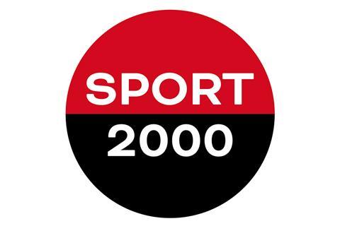

Sport 2000 Group International has once again updated its logo. This is to be as visible on digital platforms as possible, the company said.
The new design fulfills the highest digital requirements, strengthens international recognizability and at the same time remains locally connectable. It emphasises the clear positioning of over 2,300 retailers in 17 countries as a modern, networked community in the sports retail sector. The rollout is carried out independently by the respective country organizations.
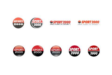
“Brands must constantly evolve in order to remain relevant. Our previous logo from 2007 was no longer up to date in terms of its impact, especially in the digital sector,” said Margit Gosau, CEO of Sport 2000 Group International.
The new Sport 2000 logo focuses on clear lines, modern typography and high flexibility in both analog and digital use. The red color has also been adjusted. “In line with our positioning, we are opting for a warmer, more vibrant shade of red. This creates closeness and expresses our ‘human touch’ even better,” explains Mike Kerbage, Head of Marketing at Sport 2000 Group International.