
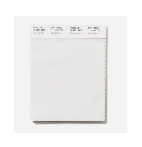
Pantone has revealed its 2026 colour of the year: Cloud Dancer, a soft white hue described as “billowy” and “balanced”. The announcement marks the first time the colour authority has selected white since it began naming annual trend-setting shades in 1999.
According to the Pantone Colour Institute, Cloud Dancer represents a conscious move towards simplicity and focus. “The cacophony that surrounds us has become overwhelming, making it harder to hear the voices of our inner selves,” said Leatrice Eiseman, the institute’s executive director. “Cloud Dancer enhances our focus, providing release from the distraction of external influences.”
Laurie Pressman, vice president of the Pantone Colour Institute, describes the shade as “reflecting what people are looking for” and suggests it promises to inspire a rebirth. “Similar to a blank canvas, Cloud Dancer signifies our desire for a fresh start,” she said. “An airy white hue, PANTONE 11-4201 Cloud Dancer opens up space for creativity, allowing our imagination to drift so that new insights and bold ideas can emerge and take shape.”
Diminished influence in the social media age
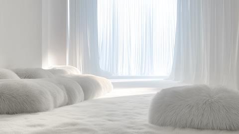
Whilst Pantone’s colour of the year once held significant sway over design and fashion trends, its influence has waned in the age of social media, where platforms like Instagram and TikTok now dominate trend cycles. Still, white has been prominent on recent runways and within the “quiet luxury” aesthetic — the trend of expensive-though-understated and logo-free neutrals popularised through cultural moments like Sofia Richie’s wedding and Gwyneth Paltrow’s high-profile civil trial.
Mixed reactions across social media
The choice has sparked debate on social media, with reactions ranging from interested to outraged. Some critics have questioned whether naming white as the colour of the year feels tone-deaf amid ongoing cultural and political tensions, with one user declaring the choice “feels like a microaggression”. Others suggested it reflects economic anxiety, with one commenting: “The colour of the year being colourless is a recession indicator.”
Part of a pattern: colours for calm
This isn’t the first time Pantone has selected a colour to encourage tranquillity and alleviate stress. Previous picks include Honeysuckle (2011) to “lift spirits”, Turquoise (2010) for “comforting escape”, and Peach Fuzz (2024) to express a desire to “nurture ourselves and others”.
Go deeper
The Story of Pantone color of the year 2026